
The project
The project was to design the web screens for the e-commerce flow of eSIMs till the user gets to viewing all the available plans.
The designs were done over a span of 1 week.
The project goal was to try some unconventional concepts and design something very experimental to generate curiosity among users. For the initial stages, the team wanted to focus on monitoring the Click Through Rate and
focus on conversions.

The users
I created two personas to document and refer while designing. This made sure that the designs were not deviating from user requirements and can fit between juggling multiple tasks users are doing before their travel.


Task flows
All our competitors were following the same task flow for users to purchase an eSIM. Although this was functional, we wanted to add a touch of personalisation to the experience.

One insight from the marketing team that was very helpful:
“A large number of users of similar products purchased eSIMs on their way to the airport or at the airport. These users are frequent users of eSIMs and probably know which plan would fit their needs.”

By taking information about the trip duration, we could personalise the experience more, by curating a list of plans catering to the user's needs. This could help in simplifying the decision making process and increasing purchases.
The Designs
A few notes to myself before brainstorming ideas:
Users should be able to easily enter information.
Something experimental should not confuse users.
Design something that is FUN TO EXPLORE!
Initial explorations
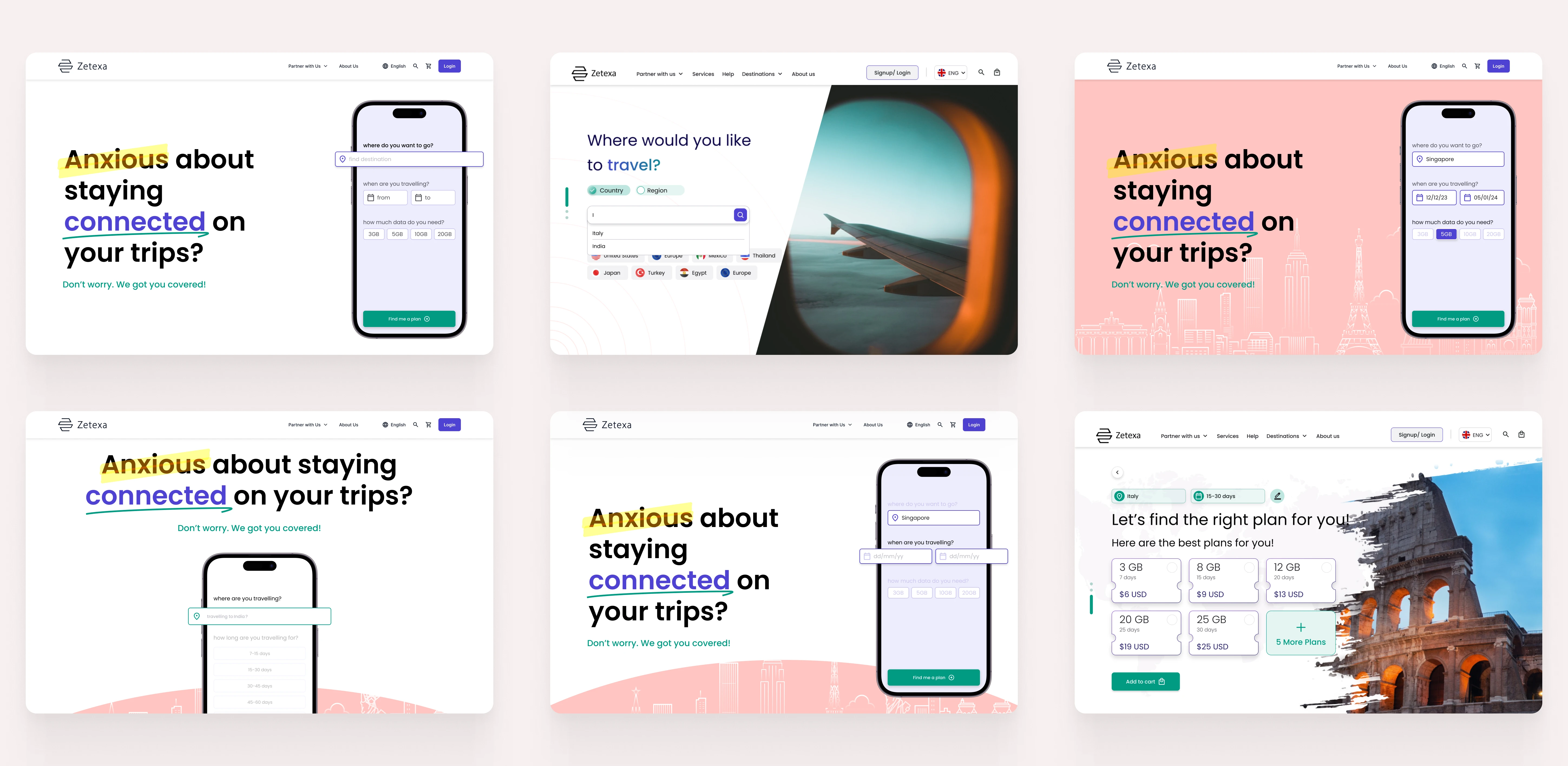
STEP 1: Getting information
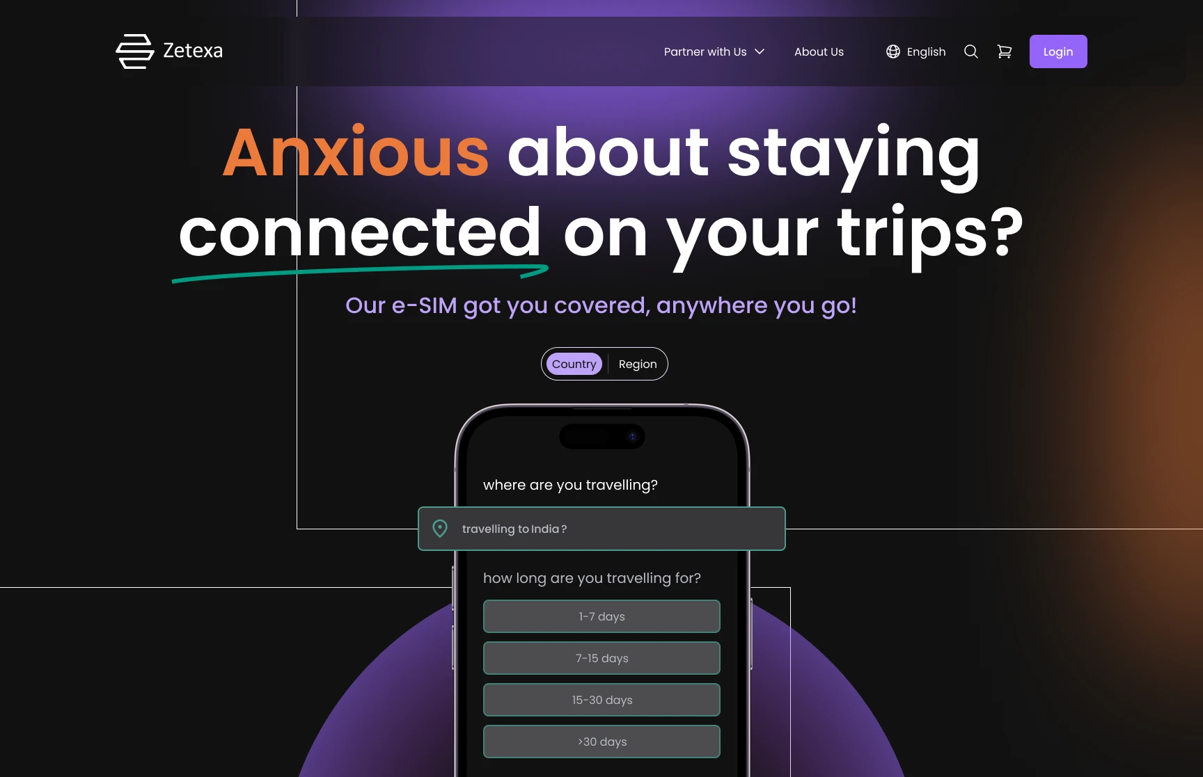

These 2 inputs from users would let us curate data packs for them based on their input and recommend plans for users, making it easier to take decisions.
The phone mockup and the exaggerated animation of the duration picker keep the user’s attention and create more intreague. This was done to ignite curiosity in the user’s mind to continue exploring.
Quick selection
By showing users 2 plans, we made decision making easier for users.
The state and function of the CTA changes as the user progresses with their decisions.

Applying Hick's Law, we showed two plans which would be most suitable for users. In case users wanted to explore their options with other plans, they could be directed to that as well from here.
All plans


So…What's with the Bento Grid??
Breaking the pattern of a standard grid or list, I designed a Bento grid that prioritises the information users have entered. The plans of the top 2 cards are the same as shown in the Quick Selection screen, making it easy to locate those plans.
With the "MOST POPULAR" and "ZETEXA RECOMMENDED" tags, we eased the decision making process for users.
The idea was to design a screen that was unique, yet functional and scalable to other products to be launched.